Pareto charts are charts that have both the column and the line graph. Pareto charts are used in statistical analysis, and thus they are important. Constructing a Pareto chart by hand seems to be time-confusing and difficult. The latest versions of Excel have an in-built feature that is used to construct these Pareto charts. However, the older version of Excel doesn't have a specific feature that can be used to construct Pareto charts but instead, workarounds are involved to achieve the same.
Let us now dive deeper into how to construct a Pareto chart using Excel.
Pareto charts in latest versions of Excel
The latest versions of excel (from 2016) have an in-built feature that can be used to construct a Pareto chart.
Steps;
1. Open your new worksheet or an existing excel document.
2. If you're working on a new worksheet, Enter your dataset on the empty cells.

3. On the main screen, locate and click on the "Insert tab."
4. From the Insert Tab, click on the histogram-like icon drop-down menu.

5. The latest version of Excel has an in-built that can automatically convert your data into a Pareto chart. Therefore, from the Histogram drop-down menu, click the Pareto icon.
6. All your data will automatically be converted into a Pareto chart.
7. To add charts elements;
- Click on the + buuton on the right-side of the drawn chart.
- Then, customize the side-view menu.

Now you have a complete Pareto graph.
Pareto charts in older versions of Excel
If you're using the older versions you can still construct a Pareto chart. You can do this by combining both the line and column graph. Here are the steps to do so;
1. Open your new worksheet or an existing excel document.
2. If you're working on a new worksheet, Enter your dataset on the empty cells.

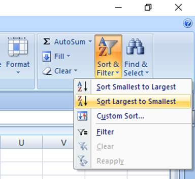
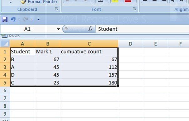
3. Arrange you data in descending order. Highlight the marks column, then from the home tab, click the "Sort&filter" tab. From the drop-down menu, choose "Largest to smallest."

4. Since the Pareto chart is a combination of two graphs, line and column, you have to add another column of the cumulative count of your data.

5. Then, highlight all your datasets. Click the Insert Tab and locate the column button within the chart section. Click on its drop-down menu.
6. On the drop-down menu, choose the "2-D clustered column." On clicking, your highlighted data will automatically be converted into a graph.

7. Now let us change the Cumulative count from column graph to line graph. To do so, right-click on the drawn graph, and then select the "Chart series type" button. Click on it.
8. From the Chart series type dialogue box, click on the "Line" button and select a line graph that fits you best.

Now you have a complete pareto chart. You can customize using other excel features.
In conclusion, you can draw a Pareto graph in either the older or latest version of excel.
